.png)
Summary
READ ITMost ecommerce advice sounds like it was written by someone who’s never actually run a store. You get the same recycled tips about email marketing and product photography, while the stores crushing it are doing something completely different.
We spent the last few years digging into what fast-growing ecommerce brands actually do when nobody’s watching. Not their Instagram strategy or their paid ads, but the decisions they make when they’re trying to figure out why sales dropped or how to handle a clogged funnel.
What we found surprised us. The gap between stores that plateau at $10k/month and ones that hit seven figures isn’t hard work or better products. It’s actually specific operational moves that most people either don’t know about or think are too risky to try.
We’ll show you exactly what these stores do, with real examples you can steal.
Secret #1: Letting Customers Hunt the Way They Want to Hunt
Most ecommerce stores organize their products the way they think about inventory. By category, by price, or by what’s new. But shoppers don’t think like store owners. They think about what they’re trying to solve.
The stores that grow fastest let people filter by their actual situation. Instead of making someone dig through hundreds of options, they cut straight to what matters for that specific buyer at that specific moment.
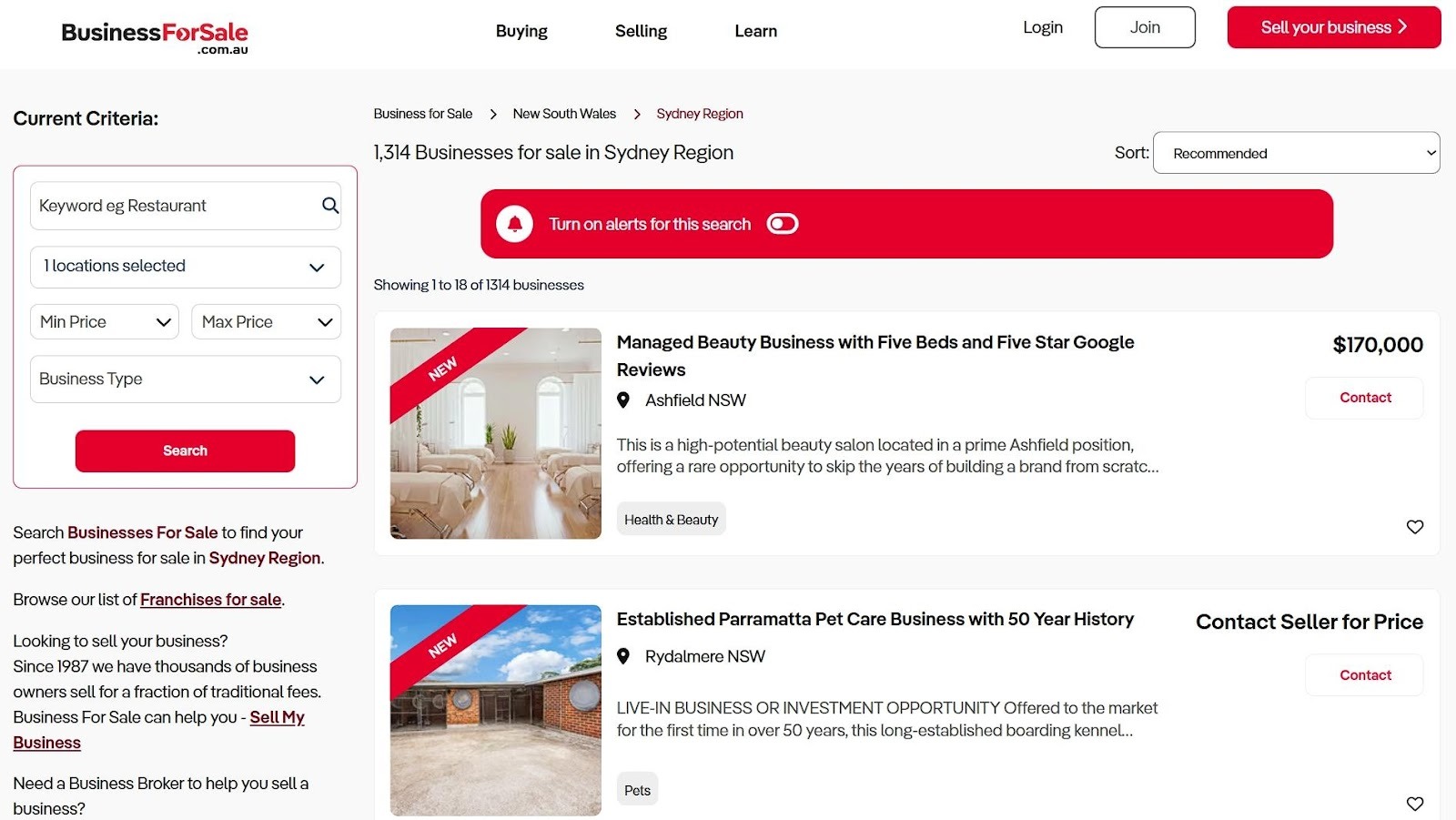
Example: Business For Sale
Business For Sale is an Australian marketplace where people buy and sell existing businesses. They could’ve organized everything by industry or location and called it a day. Instead, they built their filtering around how buyers actually make decisions.
When you’re looking at this city page, the left sidebar lets you set your budget range first, then narrow down by business type. You can sort results by price or how recently they were listed. This matches exactly how someone thinks when they’re shopping for a business.
It sounds simple, but many sites don’t do this. They mae you wade through irrelevant options because their filters reflect internal organization, not buyer logic.
How to Implement This:
- Map out your buyer’s actual decision process. What’s the first question they ask themselves? What’s second? Build your filters in that order.
- If you sell skincare, let people filter by their skin concern before showing them product types.
- If you sell furniture, let them filter by room size before showing styles.
- Interview five recent customers and ask them how they narrowed down their choice. Whatever pattern emerges, that’s your filter hierarchy.
Secret #2: Building Pages That Speak One Language
When you walk into most ecommerce stores, you see a homepage trying to appeal to everyone at once. Different customer types with completely different needs, all funneled to the same generic sales pitch.
Fast-growing stores don’t do this. They create separate landing pages for each type of buyer, speaking directly to that person’s specific situation. When you address the exact concerns someone has, conversion rates can jump by up to 80%. Speaking their language matters that much.
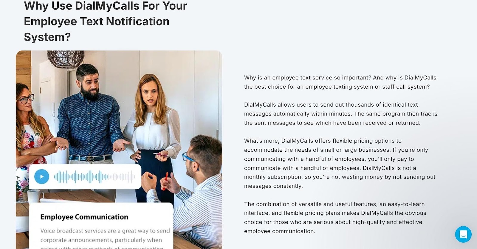
Example: DialMyCalls
DialMyCalls offers mass text messaging services. They could’ve built one landing page explaining their platform’s features and hoped different customers would figure out how it applies to them. Instead, they created dedicated pages for each audience segment.
Their Employee Texting Platform page targets companies specifically. The entire page focuses on workplace communication, how managers can reach their teams during emergencies, send shift updates, or handle scheduling changes.
The copy, examples, and benefits all speak to someone managing employees, not to churches sending prayer updates or schools announcing snow days.
Each segment gets its own page with messaging that matches their world. An HR manager sees themselves immediately because the page talks about their exact problems in their exact context.
How to Implement This:
- List your three biggest customer segments. Write down the specific problem each group is trying to solve with your product.
- Create a landing page for each segment. Change everything: headlines, product descriptions, testimonials, and even the images.
- A busy parent shopping for meal kits needs different reassurance than a fitness enthusiast does.
- Run traffic to the right page based on where people come from.
- If you run a Facebook ad about quick dinners, send them to the parent page. Similarly, blog posts about macro tracking should link to the fitness page.
- Stop making everyone translate your generic message into their situation.
Secret #3: Adding Proof That Lives Where Decisions Happen
You can write the perfect product description, but it won’t matter as much as you think. That’s because 92% of customers trust recommendations from other buyers over anything a brand says about itself.
Successful stores plaster user-generated content across every product page. They don’t bury it at the bottom after a scroll, but place it front and center where people actually look. They know that a real customer’s messy iPhone photo outperforms professional product shots when it comes to building trust.
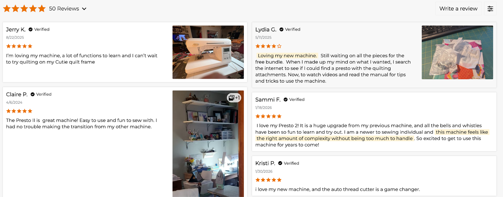
Example: Sewing Parts Online
Sewing Parts Online sells sewing machines, parts, and supplies. This type of company attracts people who need to know exactly what they’re getting before spending hundreds or thousands of dollars.
Look at their product page for the Baby Lock Presto II. The customer reviews section shows star ratings and text. More importantly, real buyers post photos of the machine in their actual sewing rooms, mid-project.
You’ll see the machine on someone’s craft table with fabric halfway through it, or set up in a cramped apartment corner. These photos matter because they answer questions the product description can’t. How much space does it actually take up? What does the stitching look like on real fabric? Does it look as bulky in a home setting as it does in the studio shot?
Customers show you the truth. That’s what converts browsers into buyers.
How to Implement This:
- Start asking for photos in your review request emails.
- Offer a small discount on their next purchase if they submit one. Even $5 off works.
- Display these photos prominently on product pages, not hidden in a review tab.
- Put them near the add-to-cart button where people are making their decision.
- If you’re starting from zero reviews, send free products to recent customers in exchange for honest feedback with photos. Ten real reviews beat a thousand generic product descriptions.
Secret #4: Displaying Pricing That Leaves No Room for Doubt
Hiding your prices behind “Contact us for a quote” might seem strategic. In reality, it’s killing your conversions. People don’t want to play guessing games with their wallets.
Stores that show transparent pricing upfront build trust immediately. When customers know exactly what they’ll pay and what they’ll get, they stick around.
Brands with clear pricing models report 94% customer loyalty. That’s because you’ve eliminated the anxiety of wondering if they’re about to get ripped off.
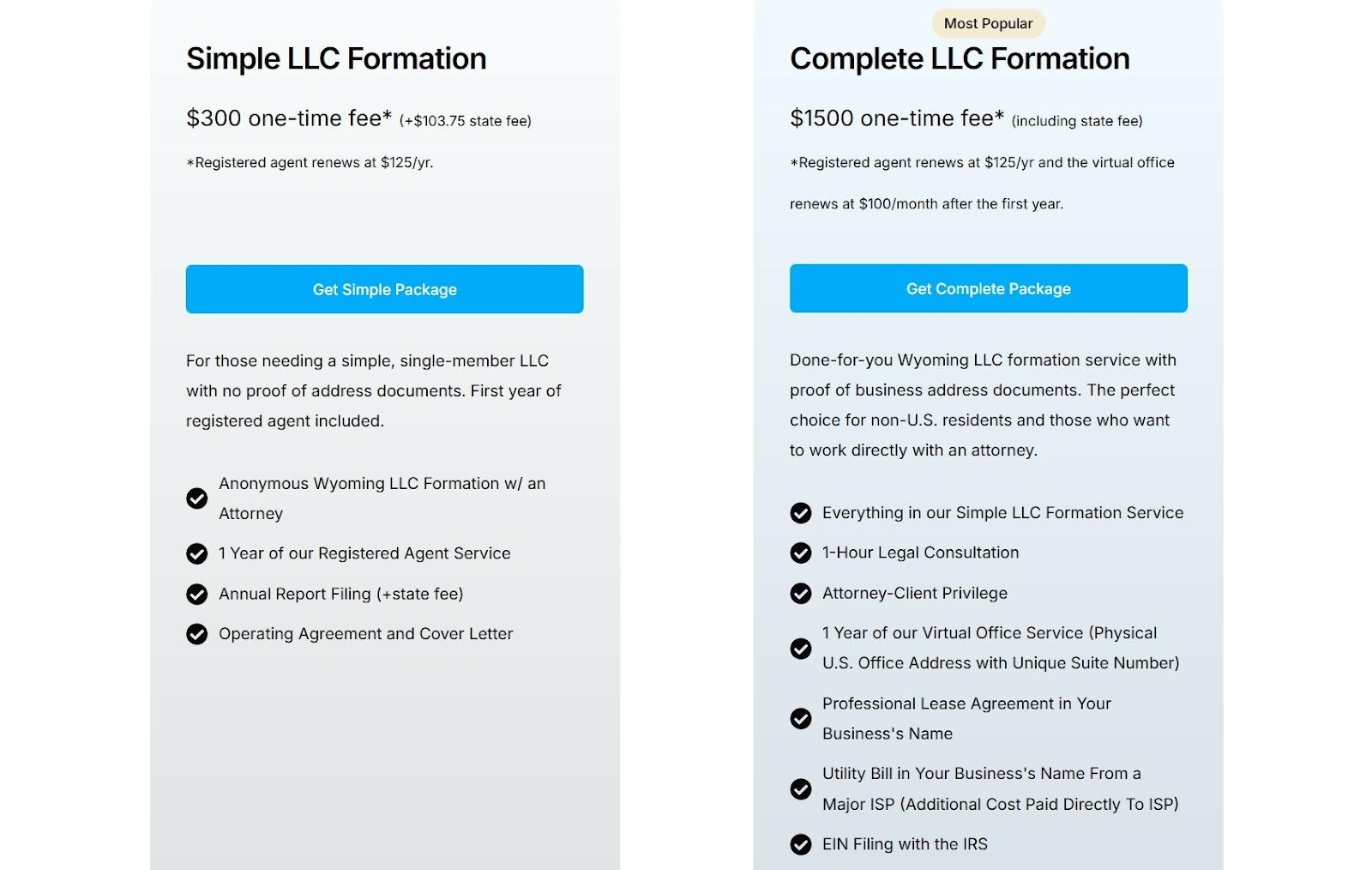
Example: Start in Wyoming
Start in Wyoming helps people form LLCs and provides registered agent services in Wyoming. This is a service where customers could easily get lost in confusing legal jargon and unclear costs.
Their landing page for Wyoming LLC formation does the opposite. They break down their pricing into clear tiers, each with detailed descriptions of what’s included. You’ll see exactly what the basic package covers versus the complete option.
The prices sit right there on the page. There are no forms to fill out and no sales calls required. Everything’s presented cleanly. No asterisks leading to fine print about hidden fees. No “starting at” language that means the real price is double.
This way, visitors can compare the options side-by-side and pick what works for their situation without worrying they’ll discover extra charges at checkout.
How to Implement This:
- List every price on your product or service pages.
- If you offer tiers, show them all at once so people can compare.
- Break down what’s included in each option. Don’t just say “Premium Package”. Tell exactly what premium means in plain language.
- If you have additional fees (shipping, setup, or taxes), mention them upfront or show a calculator. People hate surprise costs at checkout more than they hate high prices.
- Own your numbers and let customers decide if it’s worth it to them.
Secret #5: Making Help Impossible to Miss
Most ecommerce stores treat customer support like an afterthought. They bury the contact link in the footer and wonder why people abandon their carts with unanswered questions.
Companies with excellent customer service are 60% more likely to retain customers and generate new leads.
Experienced brands know that when someone wants help, waiting even thirty seconds can mean losing the sale. They put support options everywhere, especially at the exact moments when buyers hesitate.
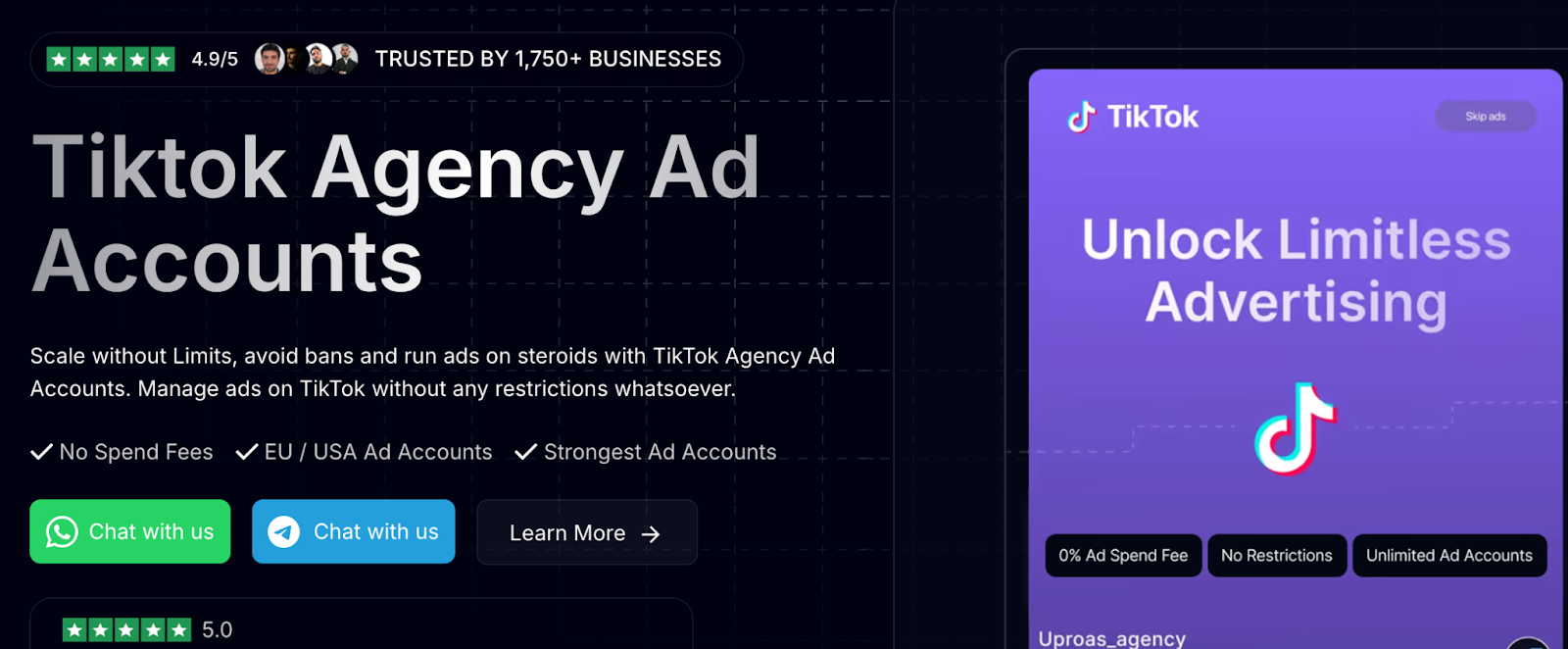
Example: Uproas
Uproas provides premium agency ad accounts for Meta, Google, and TikTok. These aren’t simple products, so buyers have technical questions and need reassurance before committing.
Look at their landing page for agency ad accounts on TikTok. The header has multiple CTAs inviting you to chat with their team and learn more. Additionally, those same buttons float in the lower right corner as you scroll through the page. No matter which section you’re reading, the option to connect is right there.
This catches people at their moment of interest. Maybe they’re reading about account limits and suddenly think, “Wait, how does this work for my situation?” They don’t have to scroll back up or hunt for a contact form. The button’s already there, ready when they are.
How to Implement This:
- Add a persistent chat button or contact option that follows users as they scroll.
- If live chat feels too resource-intensive, use a contact form or SMS option that stays visible.
- Put support CTAs near decision points, such as next to pricing tables, in product descriptions, and above the checkout button.
- Test response time. If someone reaches out, reply within minutes, not hours. Speed matters more than perfect answers.
- A quick “Got your message, looking into it” beats radio silence.
Final Thoughts
You won’t find these tactics in most marketing guides because they require actual work. They urge you to understand how your customers think, not just copy what other stores do.
For starters, choose one. Pick the secret that addresses your biggest conversion problem right now and implement it this week. You don’t need to remodel your entire store overnight.
Small changes compound when they align with real customer needs. Growth follows when the behind-the-scenes work stays consistent, practical, and grounded in how people actually buy.